THE PATCHES BRAND
A little patch.
A lot of personality.
The official guide to the Patches brand. Logos, colours and type, all in one place. Use these assets whenever you’re making something with Patches.
Download the brand kitLogos, app icons, favicons and colour references · ZIP
01 / OUR LOGO
Unmistakably Patches.
The yellow heart patch is our signature. Keep the texture, the stitching and that little tilt. They’re part of its charm.
SVGs preserve the original textured 512px artwork and outlined lettering. PNGs are ready for everyday digital use.
A ROUNDER LITTLE PATCH
Perfectly imperfect.
The familiar heart and hand stitching, with a softer, uneven circle. The same yellow patch, shown on light and dark backgrounds.
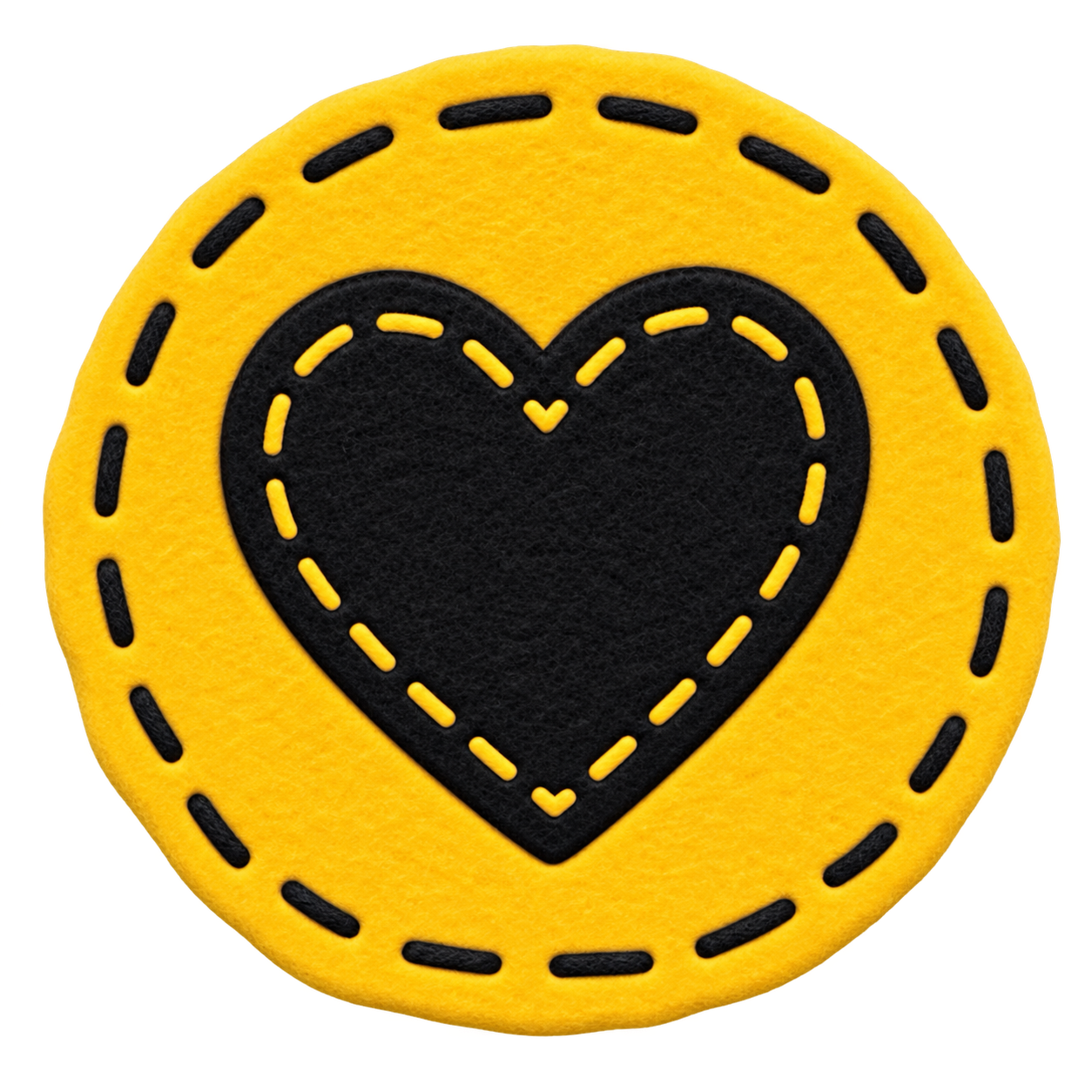
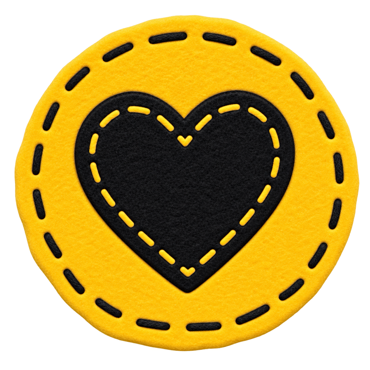
Round patch · dark
The same yellow felt and black stitched heart, shown on a dark background.
Transparent PNG artwork, 1280 × 1280. Keep the handmade edge, texture and stitching intact.
02 / THE SMALL STUFF
At home on your Home Screen.
Light and dark app icons, plus the small mark for browser tabs and bookmarks.







03 / CORE COLOURS
A sunny streak.
A little denim.
Warm neutrals keep things calm. Yellow brings the personality. Denim helps you find the next step.
Patch yellow
#FFCE00Highlights and little moments of delight.
Denim
#3E5C94Buttons and the next useful step.
Soft black
#15151BHeadlines and everyday reading.
Warm white
#FAF7F2Our light-mode canvas.
Night
#171412Our dark-mode canvas.
Cream
#F0EBE1Text and wordmarks on dark backgrounds.
Light denim
#7B96C8Links and accents in dark mode.
These are the core Patches app colours. The fabric in the logo naturally contains texture and shading.
04 / EXTENDED COLOURS
A colour for every category.
For charts, spending breakdowns and category labels. Each colour has a light and dark version so the information stays clear in either mode.
Yellow
LightMark
#A38400YellowLabel text#8A6400Label background#FFF3C9DarkMark
#FFCE00YellowLabel text#FFCE00Label backgroundrgba(255, 206, 0, 0.18)Blue
LightMark
#4689E8BlueLabel text#2D5FA8Label background#DEEAFBDarkMark
#4F8FE9BlueLabel text#6FA5EELabel backgroundrgba(79, 143, 233, 0.18)Pink
LightMark
#E85391PinkLabel text#A82E60Label background#FBDEEADarkMark
#E95C97PinkLabel text#F07FAELabel backgroundrgba(233, 92, 151, 0.18)Coral
LightMark
#FF4037CoralLabel text#B33B36Label background#FDE0DEDarkMark
#FF625BCoralLabel text#FF8079Label backgroundrgba(255, 98, 91, 0.18)Green
LightMark
#2F9E54GreenLabel text#1F7A45Label background#D8F5E3DarkMark
#52CC7BGreenLabel text#6BD693Label backgroundrgba(82, 204, 123, 0.18)Purple
LightMark
#8B5CF6PurpleLabel text#5B3FA8Label background#E8E1FBDarkMark
#8B5CF6PurpleLabel text#B49BFBLabel backgroundrgba(167, 139, 250, 0.18)Teal
LightMark
#23978FTealLabel text#10706BLabel background#D2F1EFDarkMark
#2BB8AETealLabel text#5BD9D2Label backgroundrgba(63, 208, 201, 0.18)Orange
LightMark
#EF5300OrangeLabel text#9C4A12Label background#FDE6D6DarkMark
#FF8A4COrangeLabel text#FFA772Label backgroundrgba(255, 154, 92, 0.18)Neutral
LightMark
#8C8578NeutralLabel text#54504ALabel background#EDEAE3DarkMark
#8C8578NeutralLabel text#B9B2A6Label backgroundrgba(185, 178, 166, 0.18)Indigo
LightMark
#4E52B8IndigoLabel text#3B3F9ELabel background#E0E2FADarkMark
#8C9BFFIndigoLabel text#A0ACFFLabel backgroundrgba(140, 155, 255, 0.18)Emerald
LightMark
#12805EEmeraldLabel text#0F6B4FLabel background#D4F2E6DarkMark
#4FD8A0EmeraldLabel text#66E0B0Label backgroundrgba(79, 216, 160, 0.18)Violet
LightMark
#6D3AD4VioletLabel text#5A2CB0Label background#E8DFFBDarkMark
#A78BFAVioletLabel text#B9A4FCLabel backgroundrgba(167, 139, 250, 0.18)Cyan
LightMark
#1A7E97CyanLabel text#16697ELabel background#D5EEF5DarkMark
#55C9E8CyanLabel text#6FD4ECLabel backgroundrgba(85, 201, 232, 0.18)Slate
LightMark
#5A6B80SlateLabel text#44536BLabel background#E3E8EFDarkMark
#8FA0B5SlateLabel text#A6B4C6Label backgroundrgba(143, 160, 181, 0.18)Bars and dots use the colour shown above. Labels pair a softer background with their own text colour. Use names and values alongside colour, and keep the same category colour throughout a view. Neutral is for uncategorised items.
05 / OUR TYPE
Character meets clarity.
HEADINGS / BRICOLAGE GROTESQUE
Less life admin.
Expressive, warm and a little unexpected. Use bold weights for the words that lead the way.
Get Bricolage GrotesqueBODY & INTERFACE / GEIST
Your subscriptions.
Your documents.
Your everyday, untangled.
Your documents.
Your everyday, untangled.
Clear and easy to read, from a short label to a longer explanation. Regular for reading; medium or semibold for emphasis.
Get GeistType scale
Guidance for app interfaces. These sizes do not change the typography on this page. Line heights are not specified for this scale.
| Role | Font | Size | Weight |
|---|---|---|---|
| Hero title | Bricolage Grotesque | 52px | Bold (700) |
| Section heading | Bricolage Grotesque | 22px | Bold (700) |
| Card heading | Bricolage Grotesque | 17px | Bold (700) |
| Body | Geist | 15px | Regular (400) |
| Secondary text | Geist | 14px | Regular (400) |
| Label | Geist | 13px | Medium (500) |
| Caption | Geist | 12px | Regular (400) |
| Eyebrow | Geist Mono | 11px | Medium (500) |
Secondary fonts
Geist Mono, Fraunces and Caveat also exist in the app: Geist Mono for technical labels, and Fraunces and Caveat for the Notebook look. They are not brand fonts.
Shape
| Element | Corner radius |
|---|---|
| Chips | 4px |
| Inputs | 10px |
| Cards (default) | 14px |
| Panels | 18px |
| Hero images | 24px |
Pills are for categories. Circles are for people, pets and objects.
The minimum tap target is 40px.
Dark mode surfaces
| Token | Light | Dark |
|---|---|---|
| Warm raised surface | #F1ECDF | #1F1B17 |
| Sunken surface | #E7E1D2 | #26211B |
| Secondary text | #3A3A44 | #C9C2B4 |
| Hint text | #67645D | #948D7E |
Status colours
| Status | Light | Dark |
|---|---|---|
| Danger | #BF212A | #E06A70 |
| Warning | #B87514 | #E8A33D |
| Gain | #15803D | #5DBB84 |
Status is never shown by colour alone. Include a text label or an icon with an accessible label.
06 / KEEP IT PATCHES
A few simple things.
Give it room.
Leave clear space around the logo. Keep text and other graphics at least a quarter of the patch’s width away.
Let the patch be itself.
Use the supplied artwork. Keep its proportions, colours, texture and tilt. Skip extra shadows, outlines or effects.
Make it easy to read.
Use dark lettering on light backgrounds and cream lettering on dark backgrounds. Keep the logo clear of busy images.
Sound like a person.
Friendly, useful and straight to the point. Talk about what someone can do. A little playfulness goes a long way.
Making something with Patches?
Get the whole kit